Talamus Patient App
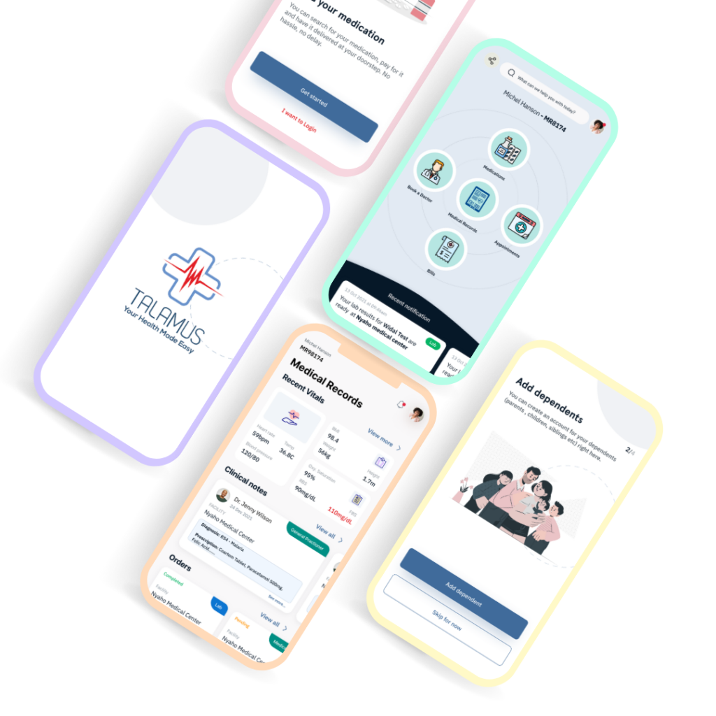
We designed an application that offer a mobile-centric healthcare system that allows patients interact with a connected circle of healthcare providers. In real time, Talamus links patients to an integrated healthcare value chain, and simultaneously connects the health service provider to a broader digital marketplace. The result is more direct access, less waiting time, access to medical information, instant notifications and efficient interactions. Patients can get all the necessary care from health care providers such as appointment scheduling, telemedicine, access to their medical records, laboratory tests, medications etc.

The Problem
The Health sector in Africa as a continent has been very chaotic in the sense that access to quality and adequate healthcare as well as providing these services, has been a problem.
The challenges can be summarized into 3 categories:
Increase in patient’s waiting time which automatically translate into increase in morbidity and mortality rate.
Patients has no access to medical record/information which means the patients are passively involved in the care journey as opposed to being actively involved.
Loss of patients medical information due to improper due to improper filing and record keeping process and also due to human errors.
Hence the need to proffer solutions to some of the challenges faced by both health care providers (Doctors, Nurses, Pharmacists, Radiologists, Laboratory Scientists, Health Recorders) as well as the health care receivers (patients)
Kick Off
In this project, we took a goal-directed design approach that proved to be quite effective in our design efforts. We found qualitative research methods to be the most useful, consisting of a kickoff meeting, literature review, competitive analysis, stakeholder interviews, and most important our persona hypothesis construction. We started out by asking ourselves some initial key questions.
“What is the product and who is it for?”
“What do our primary users need most?”
“Which users are the most important to the business?”
“What challenges could we face moving forward?”
“Who do we see as our biggest competitors?”
My Role & Timeline
My Role
- UI Design
- UX Research
Team
- 2 UX Designers
- 1 Product Manager
Tools
- Figma
- Figjam
User Research
At this phase, I interacted with lots of patients to understand their frustrations and pain points. Primary research method used was interview. This meant, I engaged in lots of field visits, and I was continually furnished with lots of feedbacks from my target users.
The major goal of the research was to understand the bottle necks and challenges faced by patients when they want to receive care at a hospital.
After interviewing the participants to establish archetypes later on, it became evident that the goals they wanted to accomplish all fell within the categories mentioned above under the challenges.
Competitive Analysis
Although we do not have direct competitors, as what we are designing is meant to function as an Electronic Health Records (EHR) as opposed to the Electronic medical records (EMR) available and offered by our competitors which means that their softwares are just limited to use in the hospital facility and patients could not interact with other hospitals with their same medical records, hence if a patient need to access care from another hospital, patient would have to start afresh as a new medical record or file would be opened for the patient, hence no continuity of care. This was a huge challenge we tried to solve with our own product.
Names of indirect competitors include:
Health Management System
Helium Health
MocDoc
Summary
We had to involve the project stakeholders (project managers, product managers and marketing team) in varieties of meetings, to brainstorm and come up with different ideas and ways of solving these challenges.
Some of the activities carried out, in other to achieve a user centered product include:
Creating User Personas that best represent our target audience
Problem statements and user stories to better understand their pain points and also mapped out the Users’ Journey using a user journey map.
Created flows and site map of the product
Storyboards were also created
Regarding the design of the patient interface of the mobile app, I had to ensure, the contents were organized so that the users would always understand where they are while using the product.

User Persona
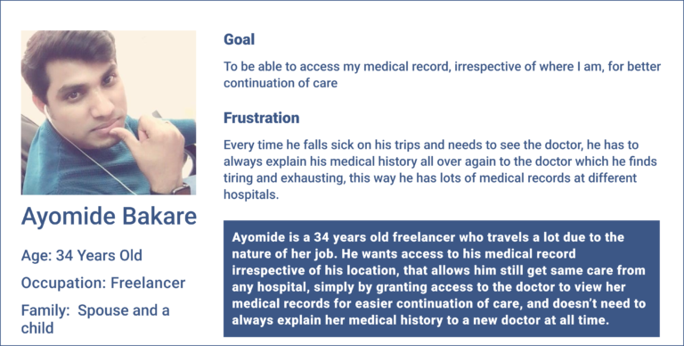
Ayomide is a freelancer who is married with a child and loves travelling. He want access to his medical record so he would be able to receive care from other doctors, without having to explain his medical history afresh, when he falls sick and he is out of town, for easy continuation of care.
Paper Sketch / Low Fidelity Wireframe
During this phase of developing, I ensure to base screen designs on feedback gotten from users (primary and secondary research) during the discover and define phase. we continued brainstorming and coming up with lots of ideas to how we want the product design to look like.
Coming up with these ideas were tasking and demanding, but we needed to place the users front and center through out the design process.
Amongst the different design method explored included Crazy Eight. Paper sketches were also made during the ideation phase after which, we (design team and project stakeholders) decided on the best design approach to follow, still keeping the users in mind. Once the best designs from the paper sketch was selected, I moved on to creating digital wireframes (low fidelity wireframes)
The low fidelity wireframe, focused on the structure as opposed the feel and look of the app. I ensured the stake holders were carried along all through the different stages of the design process.
First stage of Usability Testing
This round of usability testing, of testing was done with the low fidelity prototype to test the functionality of the app. The method used was moderated usability studies, before creating the high fidelity wireframes of the product, in order to reveal possible usability problems. A lot of iterations were made at this stage. The major goal was to design an interface that addressed all users pain points, while keeping the app simple and easy to use. This was done in house with the team to discover possible usability problems.
I and the team went through the low fidelity prototype, identified lots of usability issues and did lot of iterations, reviewed the lo-fi prototype with the stakeholders (management) and also continued iteration.
These findings were grouped and categorized by placing similar observations in a group using affinity diagram. Adjustment were made both to the user flow and also some of the wireframes (screens) were redesigned to simplify the flow there by creating a better experience for the users based on the insights gotten from the study.
UI Design
After the first round of usability testing with the low fidelity prototype, I proceeded in designing the mock ups (high fidelity) screens
Design system was used while creating the high fidelity wireframes (mockups) and one thing I had to pay attention to was the brand color, to ensure it was consistent across all screens.

Second Stage of Usability Testing
The Usability study method used were both moderated and unmoderated usability study. More testing were done both internally and externally by both QAs and stakeholders, which I was actively involved in. We had to do lots of iterations after each testing session.
Usability Testing Goals:
To determine if users can complete core tasks or navigate the patient mobile app with minimal or no assistance using the low fidelity prototype.
To determine the ease of use of the mobile app by the user.
All participants were asked same set of questions and observed as they carried out and completed tasks on the native app which helped identify possible usability problems.
Before launching the product, our team of QAs did lots of testing to ensure we rule out issues that users are likely to encounter when the MVP is launched. After lots of testing, changes were made to the screens that needed improvement, both in the aspect of UI and UX, after which it was handed to the Engineering team for production and final launching of the minimum viable product (MVP)
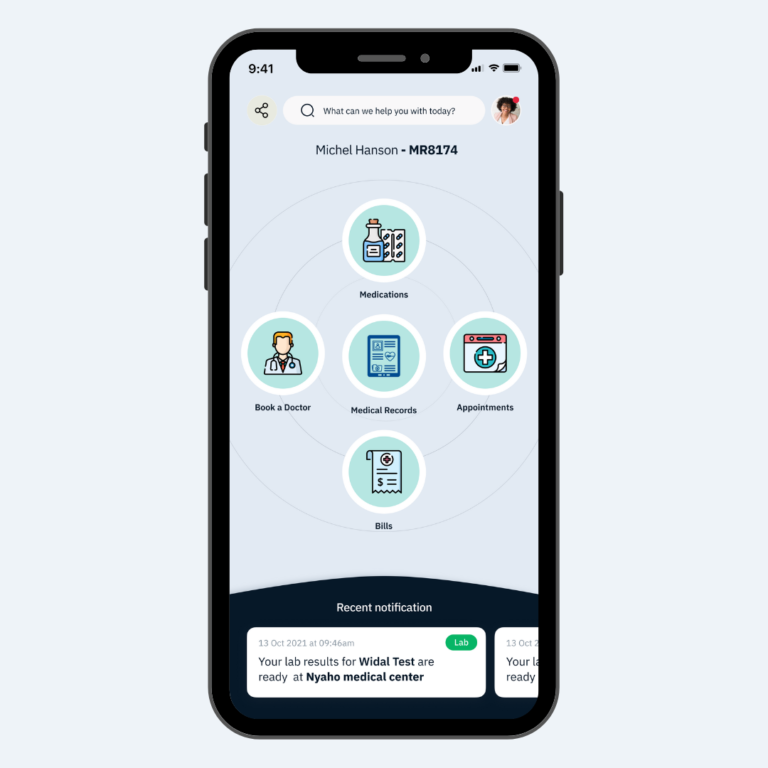
Final Screens of The Patient App
